Content for Organic Search
Pro Theme rebuild case study
Latitude College before and after website rebuild
A tired Elementor-style site was rebuilt into a cleaner WordPress experience using Pro Theme and Cornerstone. The result is easier to scan, more confident on mobile, and clearer for students who need to choose a course or make an enquiry.
Modernised presentationSharper typography, stronger hierarchy, and a calmer visual system that feels more current.
Clearer pathwaysCourse, enrolment, student support, and contact actions are easier to identify and follow.
Better mobile experienceThe rebuilt pages have cleaner mobile spacing, navigation, and content rhythm.
The comparison
Same organisation. Stronger website experience.
These screenshots focus on the parts of the site a prospective student or client notices first: the first impression, the enrolment path, and the enquiry page.
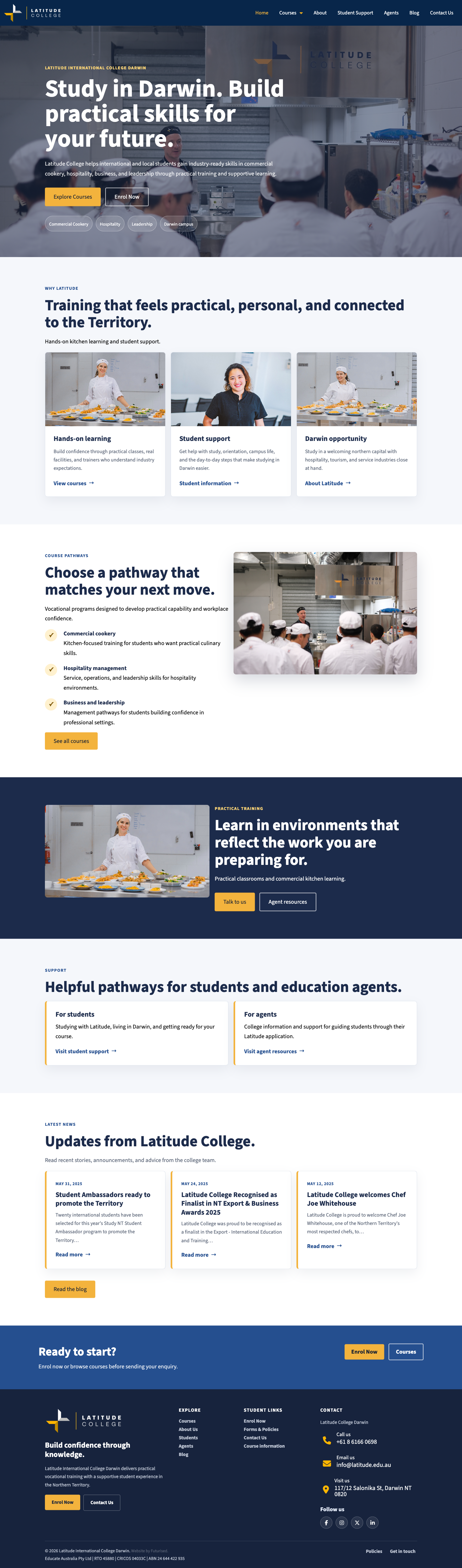
First impression
From dated brochure homepage to a clearer enrolment story
The rebuild gives the college a stronger first screen, sharper course pathways, more authentic training imagery, and a cleaner route into enquiry and enrolment.
Before Original desktop
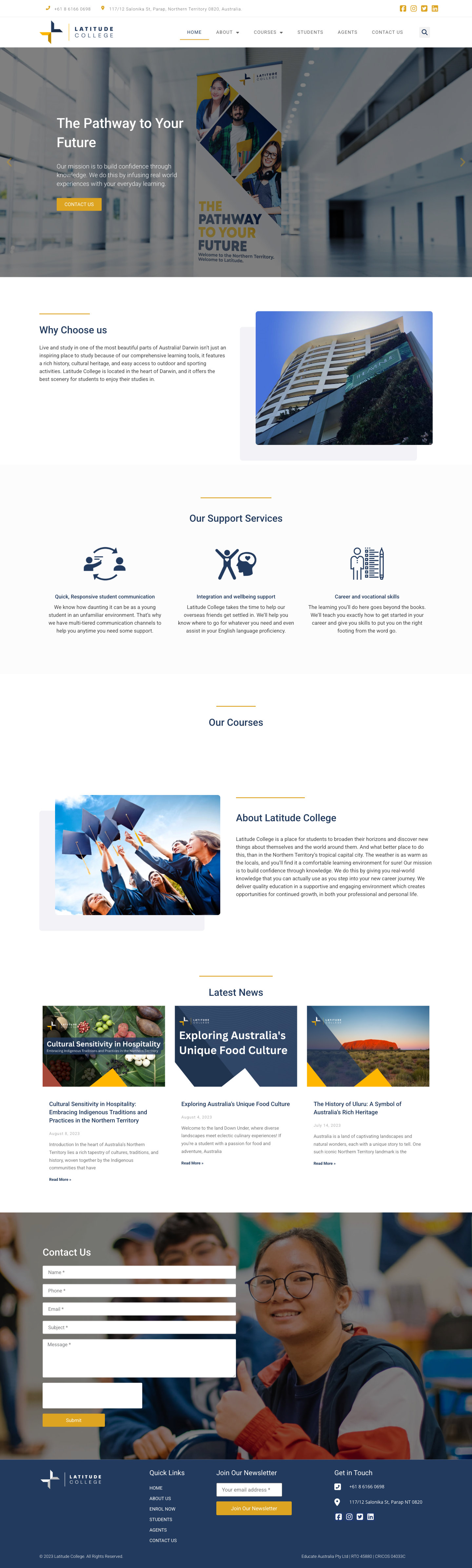
After Rebuilt desktop

Before mobile
The original page carries more visual clutter and less predictable spacing on small screens.

After mobile
The rebuild gives the same content a clearer hierarchy and a more confident mobile presentation.
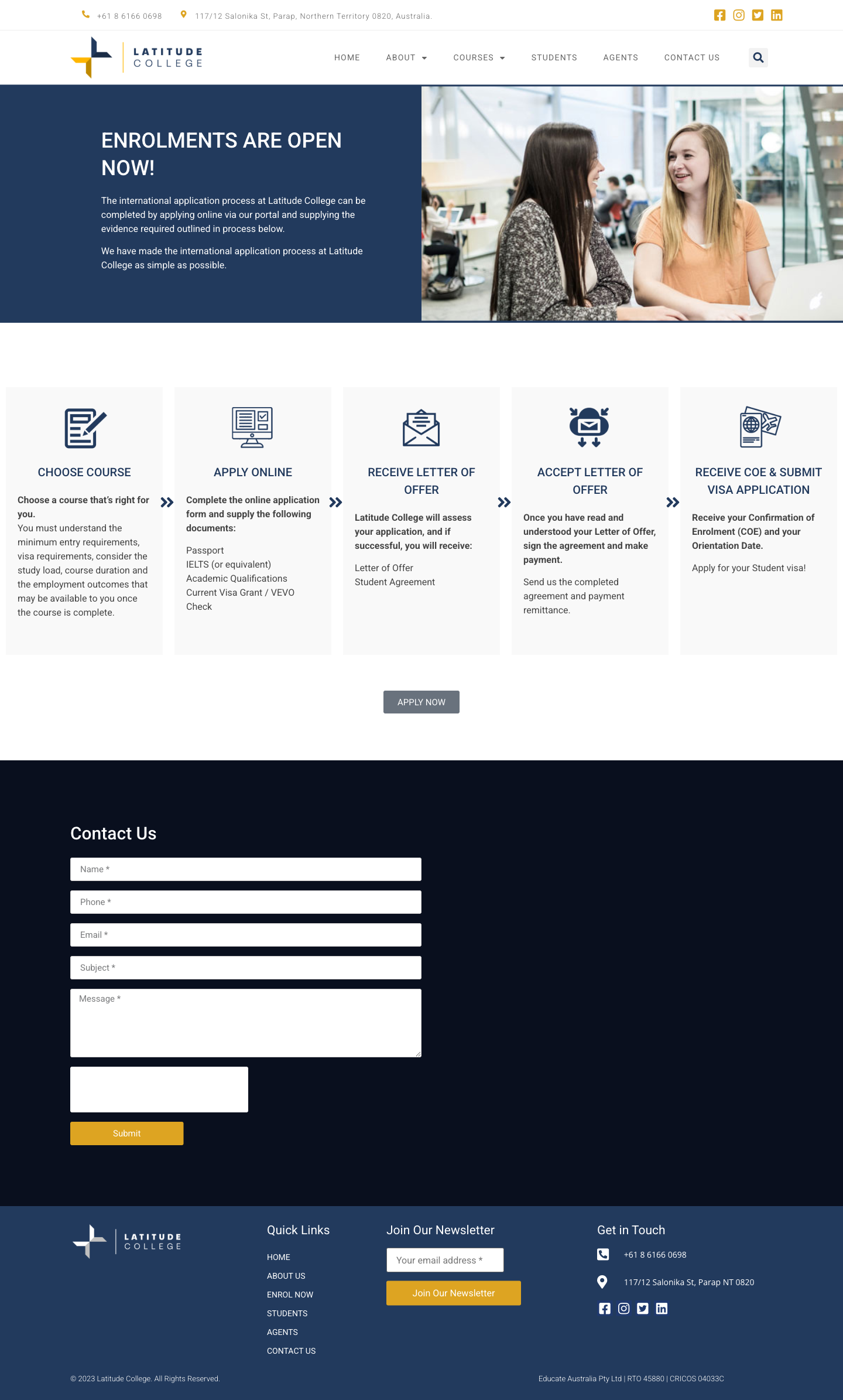
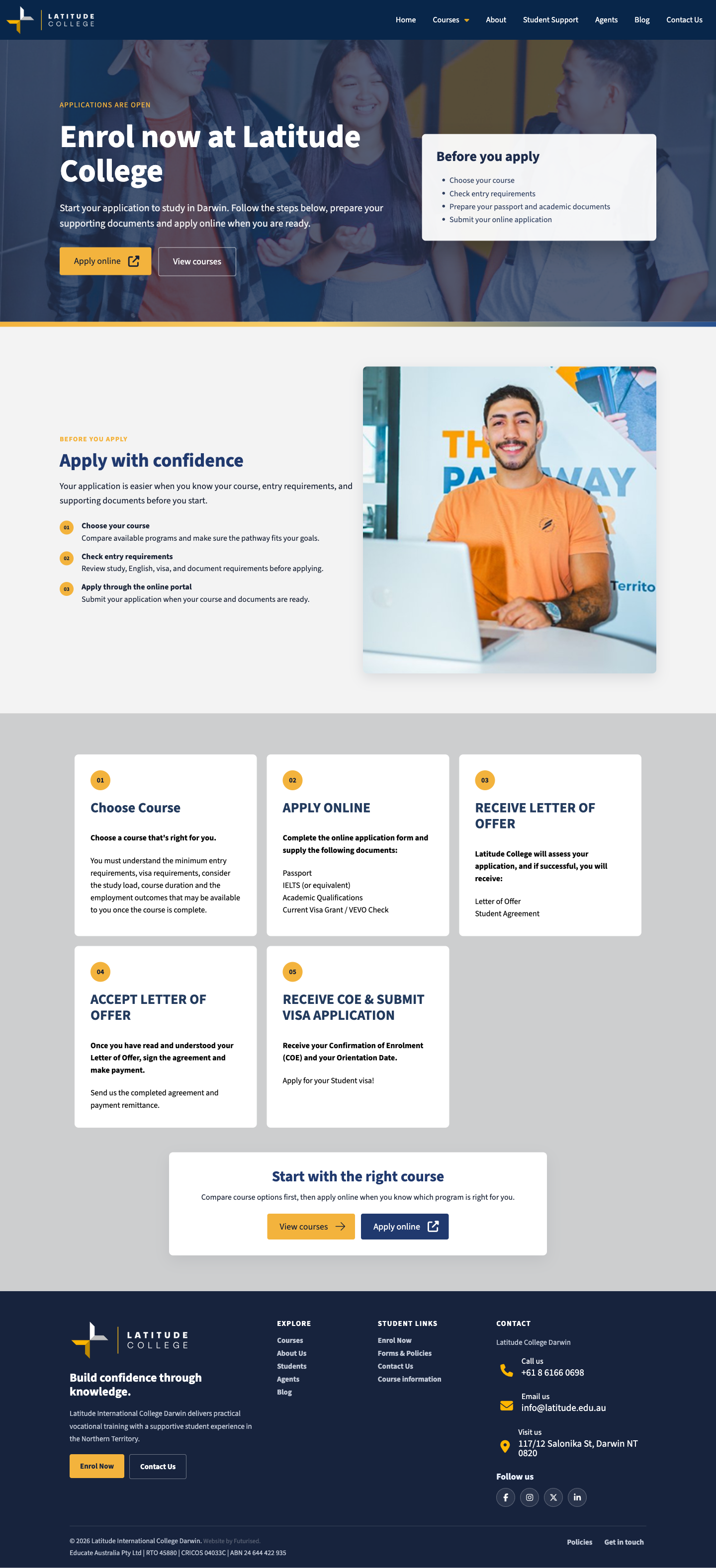
Enquiry path
From form-heavy enrolment page to a guided decision path
The new enrolment page breaks the process into readable steps, makes the next action obvious, and feels less like a wall of form content.
Before Original desktop
After Rebuilt desktop

Before mobile
The original page carries more visual clutter and less predictable spacing on small screens.

After mobile
The rebuild gives the same content a clearer hierarchy and a more confident mobile presentation.
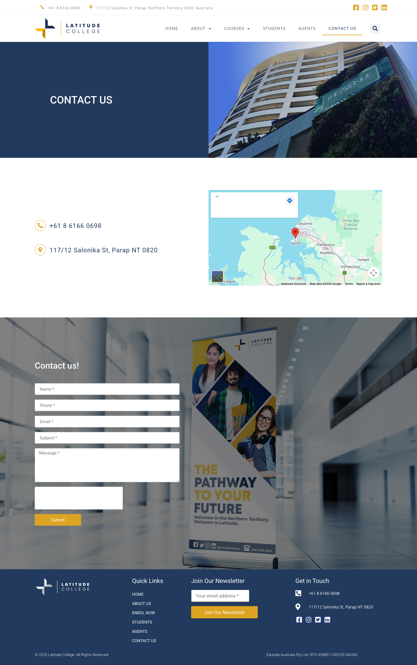
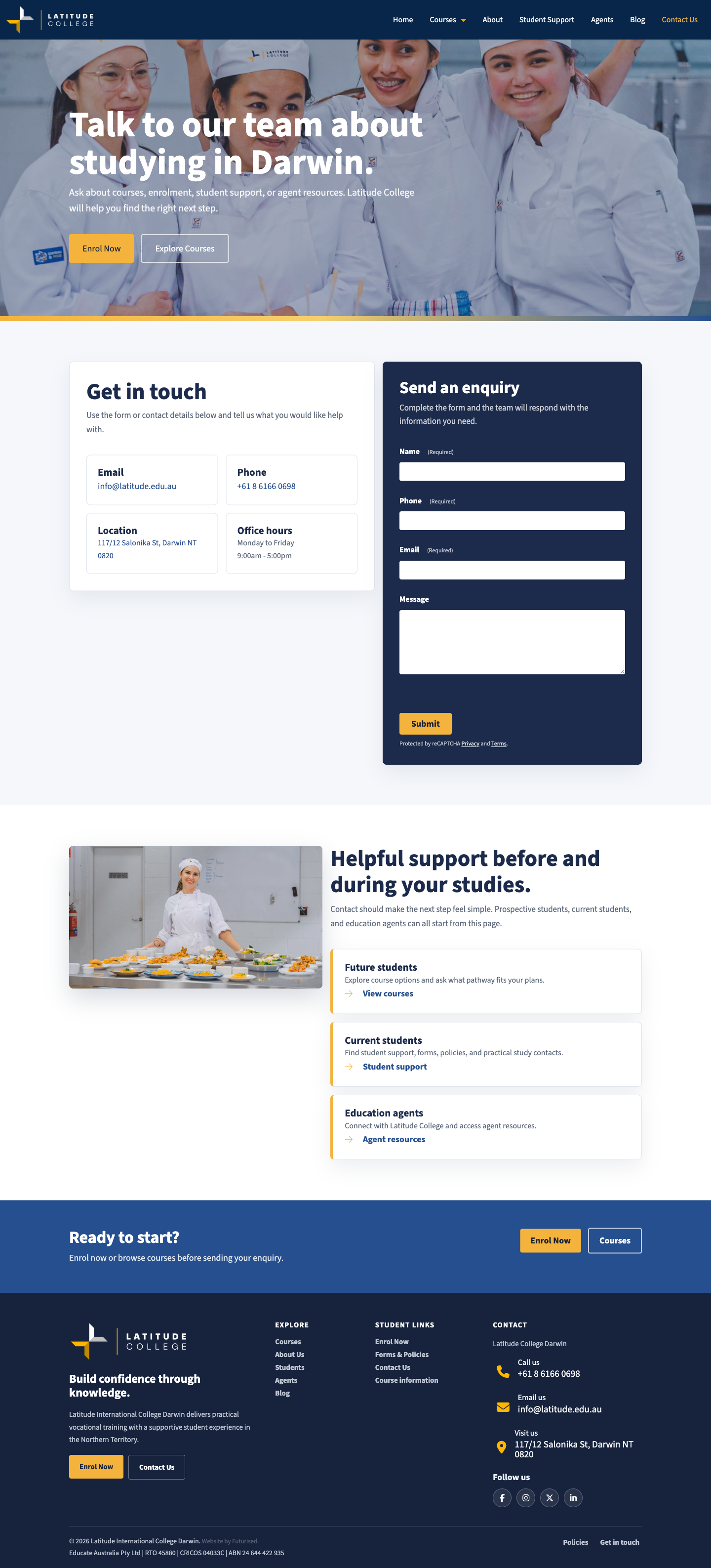
Contact page
From basic contact form to a trust-building enquiry page
The rebuilt contact page improves hierarchy, location confidence, form clarity, and mobile readability so enquiries feel easier to complete.
Before Original desktop
After Rebuilt desktop
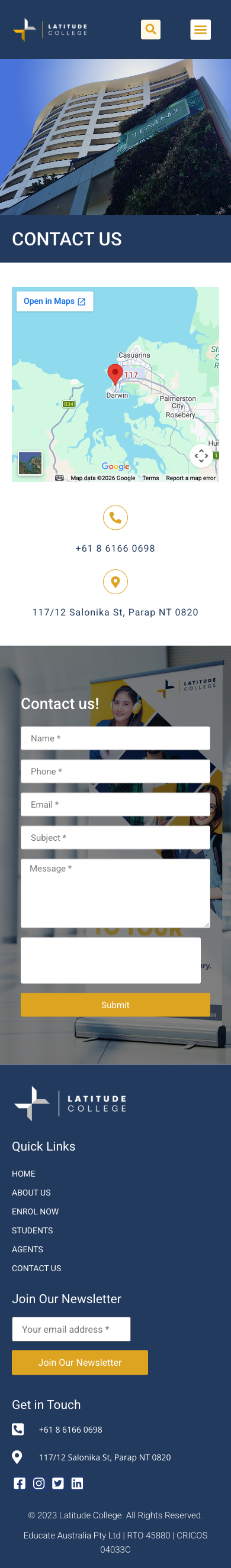
Before mobile
The original page carries more visual clutter and less predictable spacing on small screens.

After mobile
The rebuild gives the same content a clearer hierarchy and a more confident mobile presentation.
Have an older website that needs this kind of lift?
Futurised can use your current site as the source of truth, preserve the important content, and rebuild it into a cleaner Pro Theme + Cornerstone website.